


For Illustrators: Telling Story Through Color
Let's talk about the meaning of color, warm vs cool colors, and limited palettes

Dear readers,
It’s no secret that color is important in illustration and storytelling. It’s also no secret that color can be HARD. Which colors should I choose? How do I mix them? What’s the best shade of blue to use? Or hue? Or tone? What’s the difference between a shade and hue and tone again???
Color is such a broad topic and I had a really hard time narrowing down exactly what I wanted to talk about in this letter. In fact, I may even want this to be a series because there’s so much to talk about and nobody wants to read hours and hours of my rants all in one go. And frankly, I don’t want to write that much all in one letter either. So, for the sake of all of our time and sanity, I’m keeping this letter on the topic of:
Telling story through color.
Color tells a story of its own and helps children identify things starting at the very beginning of their lives. The sun is yellow. Grass is green. The sky is blue. The bear is brown. Etc. etc. Then as kids age, color begins to take on new meaning. It doesn’t just represent things, but begins to mean something. Red means warning. Yellow is happy! Blue can be cool or calming.
I talked last week (or was it two weeks ago? Who knows? Time amIright?) about different ways to enhance your visual storytelling as illustrators, but didn’t cover anything on color. That’s because I’ve wanted to talk about color separately. I actually even finished a picture book dummy on color that’s out on sub right now (fingers crossed!). I’ve shared in previous letters my process behind a couple of the spreads. Here’s a little reminder.
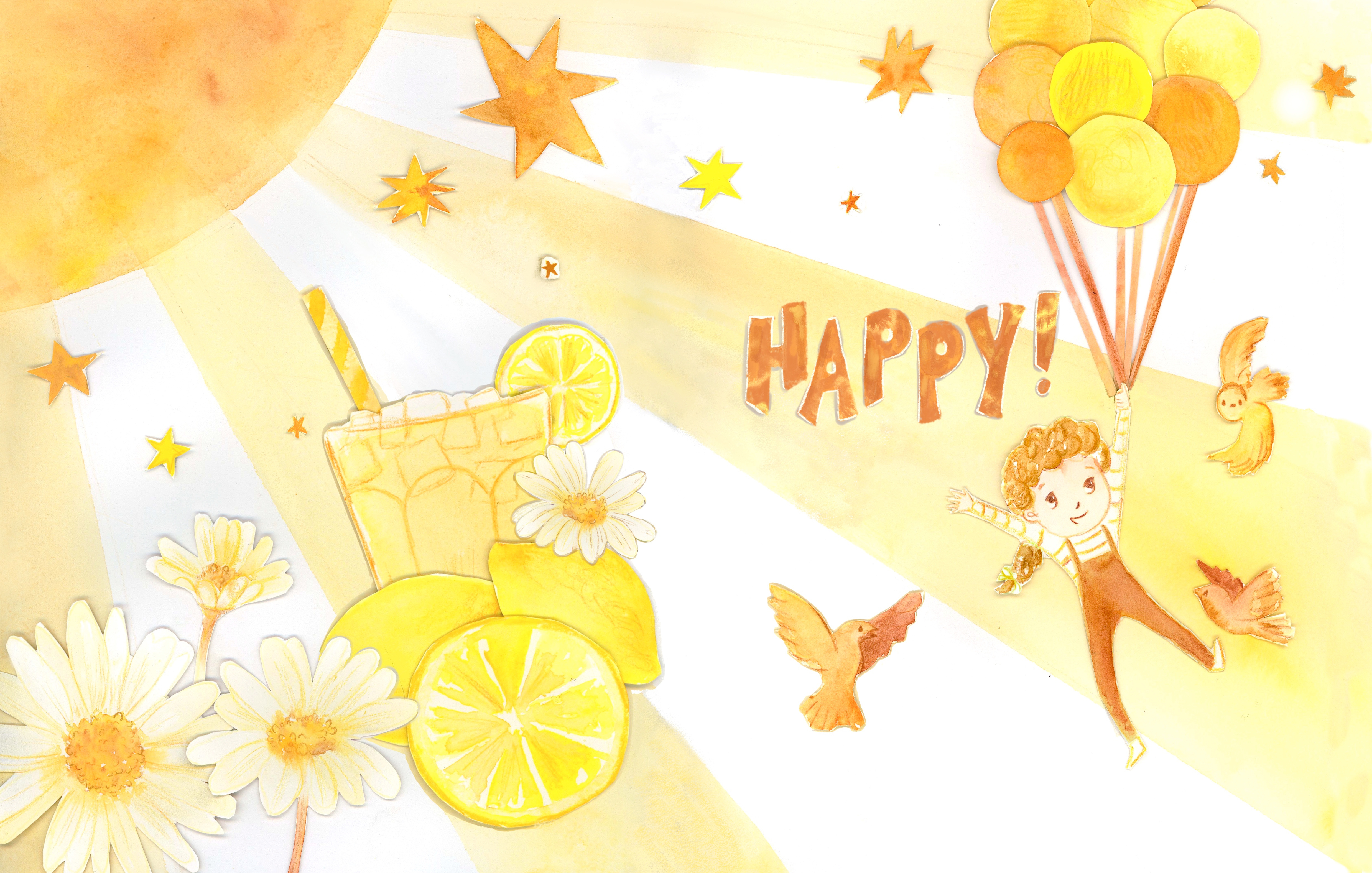
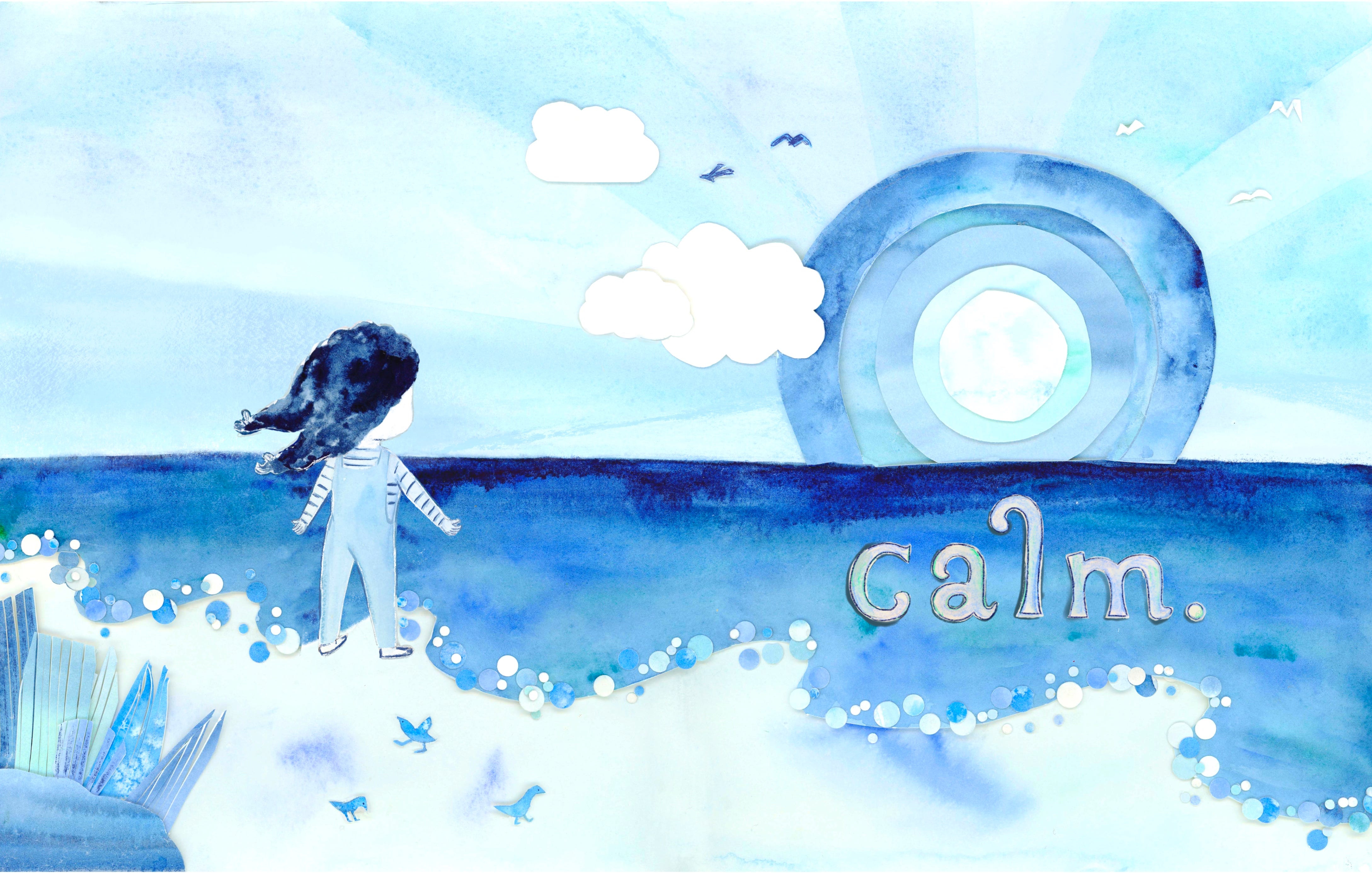
Remember these? If you don’t that’s ok. I forgive you, just this once. I wanted the book to evoke a certain feeling based on the color I was using. Yellow=happy, blue=calm. Plus, have fun with cut paper. And it was very fun. I did a lot of research on the meaning of colors. Let’s take a little looksie.
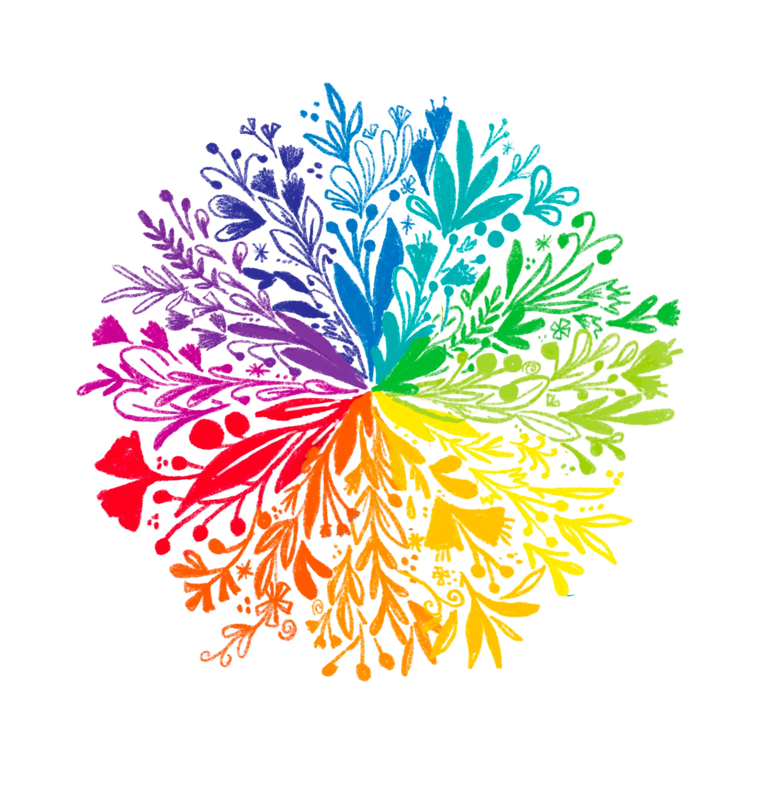
Let’s break down colors and the psychology behind them.
Red- power, passion, anger, danger, luck
Orange- energy, fun, friendliness, ruin, health, enthuiasm
Yellow- happiness, warmth, joy, optimism, illness
Green- growth, hope, life, properity, envy,
Blue- calm, freedom, cleanliness, trust, peace, sadness
Purple- spirituality, royalty, creativity, imagination, deception
Pink- playfulness, romance, innocence, kindness, materialism.
These are just a few of the meanings of the basic colors. And you’ll find that different cultures have a variety of meanings as well.
You can use the idea and meaning behind colors to help you tell your stories.
What’s your character’s personality like? Are they shy? Playful? Obstinate? What color might represent them? Maybe you can make their clothes that color. Or what if they go on a journey from angry to calm, changing from a red dress to a blue one that signifies their change of heart?
What kind of atmosphere are you trying to create for your story? What colors can help create that atmosphere? Is it chaotic? Maybe reds and purples and oranges. (Keep in mind your values though! Or perhaps it’s a quiet, calm environment. In that case, maybe you have a lot of negative space with spots of blue or pink.
Thinking about the colors as a story themselves can significantly enhance the emotion, and therefore boost your ability to tell the story.
Now that we have a basic understanding of what colors can mean, let’s talk about:
Warm vs cool colors
I’m probably going to write a separate letter on color theory where I go into more detail on this, but you’ve got your warm colors (yellows, oranges, reds) and your cool colors (blues, greens, purples).
When thinking about how you’ll use color in your illustration, ask yourself what mood you’re trying to go for.
Are you going for sweet summer vibes with warmth and fun in the sun? Then maybe stick with the warmer side of the color wheel. Or maybe it’s a sad day for your main character and they’re alone in their room crying into their favorite stuffie. Perhaps something on the cooler end of the color wheel might be the best choice to help with feelings of sadness and loneliness.
Let’s look at an example of using both warm and cool colors.
You guys know I love using a Matt Forsythe illustration example. And he’s a master of color. He has a way of using both warm and cool colors in his illustrations seamlessly. Look at this one titled “The Letter.” He starts at the top with a night sky filled with cool colors. Greens, blacks, sepias. Then we see the tree and the introduction of characters using brighter colors with a combination of cool greens, warm oranges, some umbers, tans, and yellows. The further he goes down the warmer his colors get until it’s almost glowing at the bottom. How does he do it? Tell me, Matt!! I need to know!! Ugh it’s so delectible.
So as you can see the atmosphere he creates here is one of the expansive, unending universe above the critters (cool colors), but the warmth and safety on the ground surrounding our mc reading their book (warm color). Brilliant really.

We’ve talked about the meanings of colors, and how using warm and cool colors can help further your story even more. Well let’s dive a little further and talk about:
Limited color palettes
Those who know me or have seen my work know I LOVE limited color palettes. Golly I love them. They make my heart skip a beat!
Now, while writing this letter I’ve already decided that I will, in fact, write more about color. There’s just too much content to fit in this one post. I’ll probably write an entire post dedicated to limited color palettes and how to choose them for my paid subscribers. So, if you’d like to read it, and all my other paid posts for only $5 a month and make me a happy girl, you can update your subscription here.
Picture Book Studio is a reader-supported publication. To receive new posts and support my work, consider becoming a free or paid subscriber.
But today I’ll just give you a short breakdown of some of the benefits of using them:
Using a limited color palette can make your illustration look more sophisticated.
It can make your illustration look harmonious.
It can also make the decisions within your illustration easier since you only have a few colors to choose from.
It’s easier to choose your colors by picking complementary colors, triadic colors, tetradic colors, etc. (This is something I’ll go over more in my paid post.)
Adding color constraints can actually boost your creativity by encouraging you to experiment with color mixing and trying new things.
Plus, it’s pretty and fun! :)
Here are some of my limited palette illustrations:
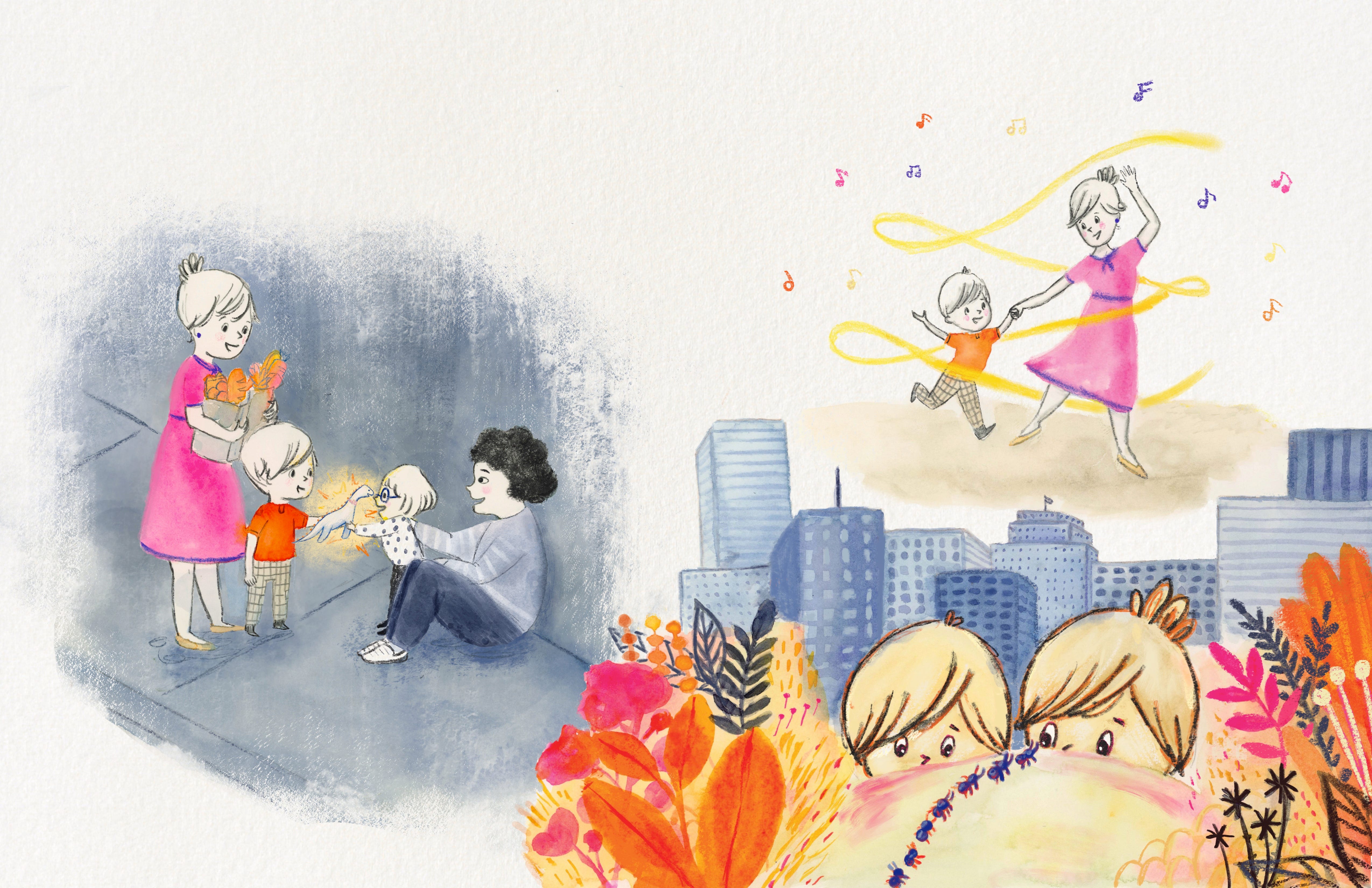


Of course, you don’t have to use limited color palettes to tell stories. This is just another way to do it! If you’re feeling a bit stuck lately, maybe try grabbing 2-3 colors and seeing what you can mix up with just those few colors.
That’s all for now, friends! I’ll be back next week with a post about colors, limited palettes, and some color theory. It should be a good time. And btw, I don’t consider myself an expert by any means. I’m just going at this, learning and growing every day, and sharing with you guys too! I hope you find this helpful, and if you do, please share or leave a comment!
xo,
Katie